28.11.2018
Every year more and more housing is built in the country. And this means that thousands of our citizens will move into new houses and apartments, will do repairs, furnish interiors, select appropriate paintings, photos, posters on the walls. After all, how can it be without such an important and catchy element of apartment décor as paintings? Mono paintings, modular paintings, photo paintings, and any images made on the basis of their own sketches, or copies of the canvases of the world’s greatest artists, can be undoubtedly found on the walls of future “cloisters of warmth and comfort.” And here we will stop and make a short pause on the important and useful, from our point of view, information, for the sake of which this article was written. Since you decided to decorate your home with a new picture, then let’s figure out what it should be, so that not only “covered a hole in the wall”, but also organically fit into the interior of the rooms and constantly delight the demanding views of the hosts and guests.
So, we will single out three main parameters, on which it is desirable to be oriented when choosing paintings in our own apartments and offices. And it will be the plot, color and size of your future quad chosen.
There are no comrades on the plot and color?
We can say that the ideal is a combination of the interior of your room, plot, color, and the size of the picture, too. It is possible to say, but it is more difficult to perform. Of course, if you are a very prudent and artistically advanced person, or you have ordered not just a repair team, but an experienced design studio, the repair and interior of your apartment (office), all of the following will be taken into account at the design stage and previously agreed with you. But, alas, often acquired paintings are already “customized” for the finished interior. And even the interior is corrected for pre-purchased canvases. To minimize or level out such situations, we give you some tips:
1. If you need to put one thing at the forefront, we would advise you to make the style and meaning of the picture basic, of course, if you have a room in one strict subject. Sacrifice color so that the spirit and mood of the decor are respected. We explain for example. Suppose you close oriental style, say, Chinese motifs. And your room is decorated in such calm and subtle tones. Perhaps, wallpaper with bamboo shoots or ancient Chinese pagodas is stuck. The entourage is appropriately matched – mats, sets for tea ceremonies, etc. Obviously, Shishkin’s The Morning in a Pine Forest or The Last Supper by Leonardo cannot be placed in such a specific atmosphere! Yes, even seemingly neutral portraits we do not recommend hanging here since even they will look alien in such an interior. But the pictures like “The branch of blossoming almond” or something from the eastern graphic (nature with animals, birds and beautifully written hieroglyphs) will fit in here organically and absolutely will convey the right mood and conceived atmosphere.
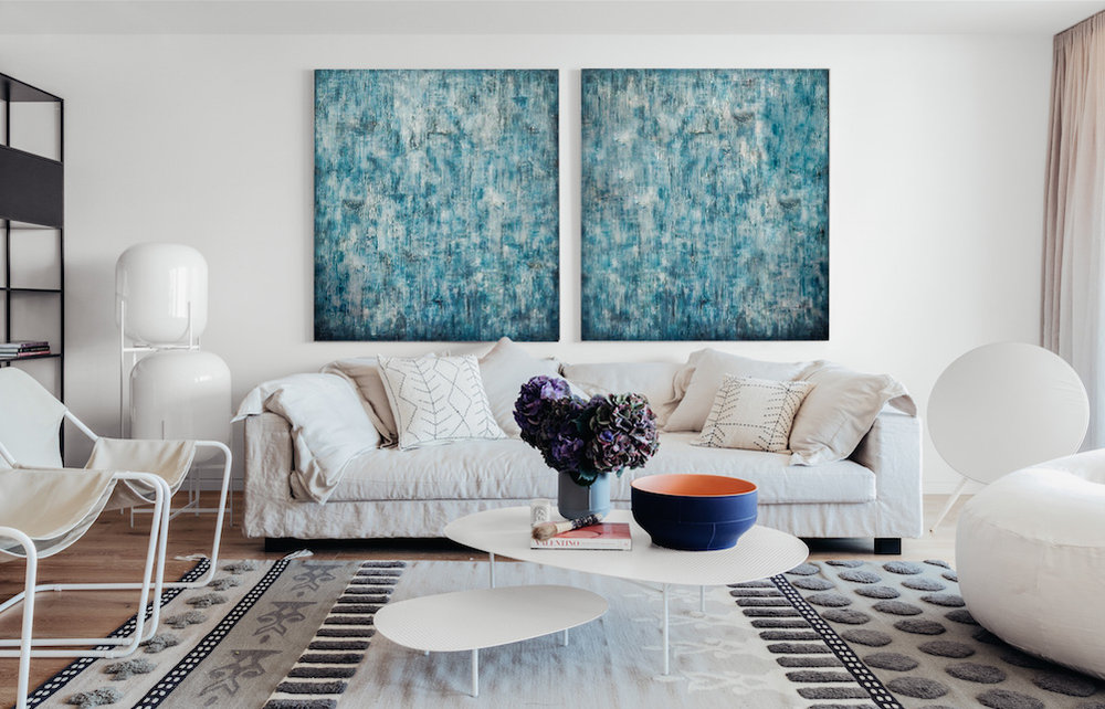
2. If your living room, children’s room or office is not decorated in a clear style theme, then the color of the picture may become the dominant factor, and the drawing or plot on it, strange as it sounds, may be secondary. Color as a way of expressing moods and ideas — this is the task of such a mono picture, a modular picture or even a series of pictures. And, remember, in this situation, the picture can organically fit into the interior, being, as it were, its continuation by other means, without getting out of the general canvas of its color plot. It will be a continuation and addition of the entourage and gently, without particularly concentrating on itself, will deprive the wall of emptiness and loneliness.
3. Or maybe your canvas, on the contrary, will be a catchy and eye-catching color spot or even a whole range of colors, with one bright and attractive color scheme prevailing in it. And now the interior becomes as if subordinate to the chosen picture, and under it, the small interior additions are selected, which overlap with its palette. For example, it may be the same tone sofa cushions. Or a rug under the table. Or a vase on the nightstand. Or lamp shade. And as the style of such “color pictures-anchors”, canvases in abstract style or large-pictured flowers are well suited (especially for paintings in modular design).
Give my favorite picture size!
And a few recommendations regarding the size of the paintings. This is not only and not so much the cost of the future canvas, as the organic perception of its image. It is also a very important parameter that can seriously affect the harmony of the interior.
1. Choose for yourself the dimensions of the picture as you choose the size of the TV, when the main thing is to see well and comfortably what is happening on the screen. The same should be with the picture, which must be clearly measured with the squared room, the height of the ceiling and the decor in the room. And note that the desired distance from the picture to the potential point of view should be not less than the sum of its two diagonals.
2. Yes, there is a so-called “knock-down scale” method among designers – large in small, small in large. But to apply this technique must be very carefully and carefully, and only having a good taste and design vision. After all, very rarely and exclusively in a certain entourage are small canvases or photographs on huge walls not looking dull and lonely. Or too large posters in small and cluttered rooms will look good and be adequately perceived. Therefore, all the same, it is better when the walls, despite the presence of pictures on them, will be enough “air” and the possibility of “breathing”.
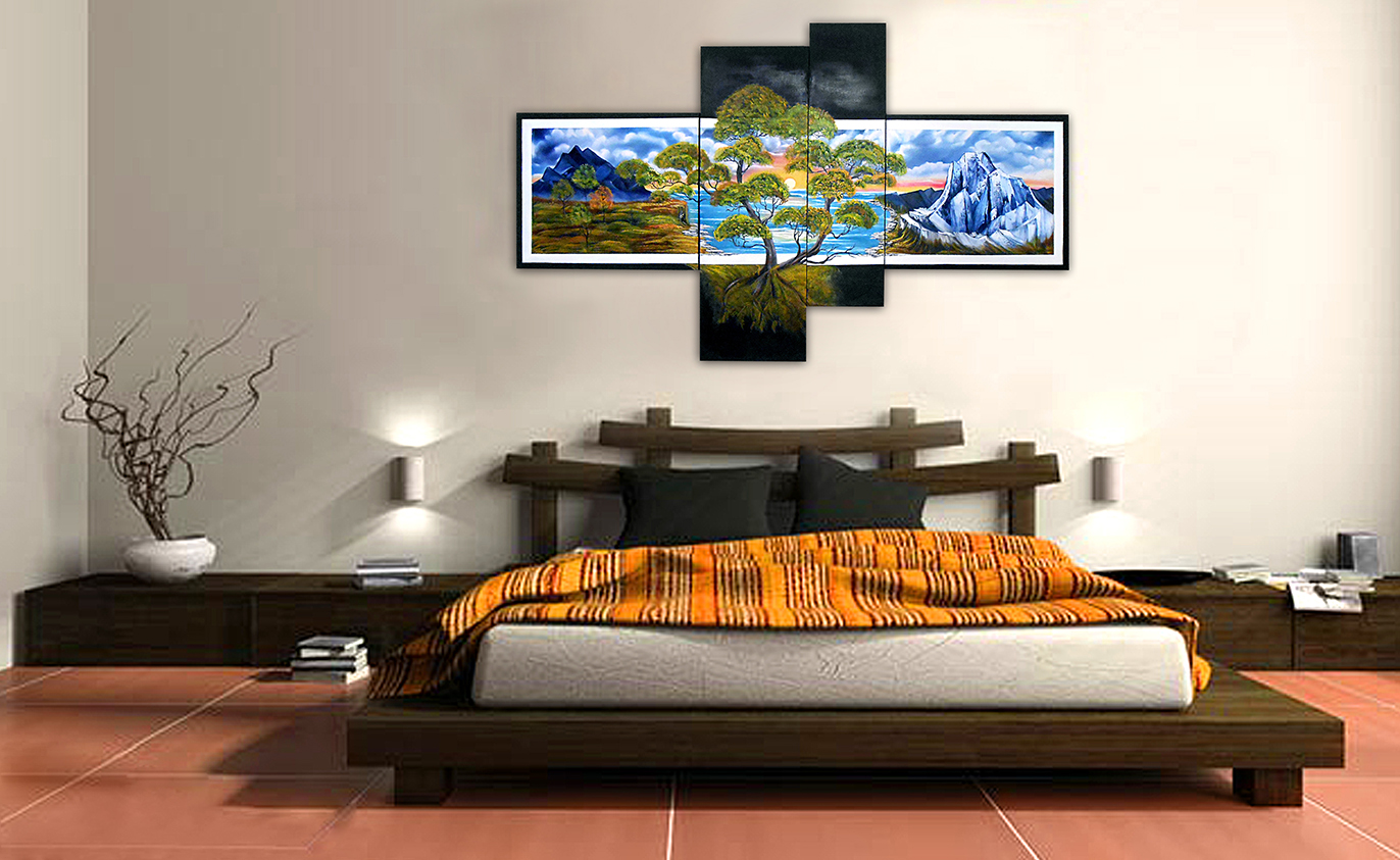
3. And never forget about the geometry of paintings or photo canvas. It is also important for the general perception of the space of the rooms since the vertically oriented paintings make the ceiling of your room as if visually higher, and the indoor space is more. Modular pictures that can not only be divided into the number of modules required for an interior with any dimensions in width and height but also vary the location of the modules themselves relative to each other, that is, actually build their own original canvas, are particularly well suited to create a visual effect!
Yourself Hermitage
Well, the last recommendation, which does not cancel all previous ones, but complements them. If it so happened that your life rule – no rules, then do not really pay attention to our article and recommendations, and buy pictures of any colors, scenes and configurations, as long as you like. In the end, there is a universal answer from disgruntled artists, creators, and other creative natures: “I see this.” And you can always use this advice and statement. Good pictures to you and unmatched interior!
Source: http://art-news.com.ua/kak-podobrat-kartinu-k-intereru-20116.html
© Art News Ukraine. Under the guidance of Sotheby’s.